Back in 2007 a daisy flower was hastily chosen as Webconverger's logo to express simplicity. Over time it has found to be a little too generic and probably not reflective of our "enterprise" positioning in the PC software market. Therefore we commissioned http://www.hawkenking.com/ to update the logo to be a little more unique and serious looking.
Update rationale
The old formats of Webconverger's logo are:


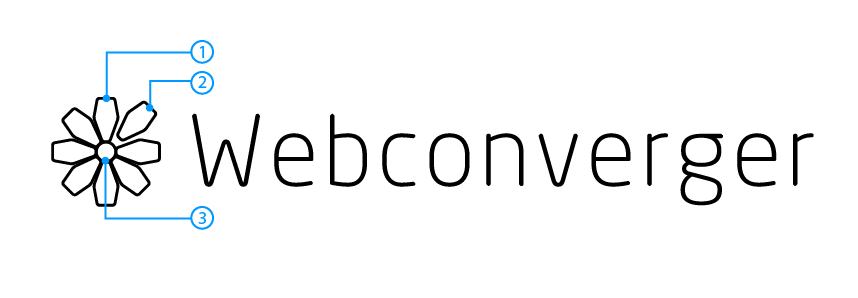
The new logo is:

- The petal symbolises a configured machine, typically deployed via USB stick, hence the shape
- The detached petal, demonstrates machines can be easily detached and reattached. i.e. moved between configurations or even to leave Webconverger services altogether, since we actively protect customers from vendor lock in
- The centre symbolises a customer configuration, e.g. https://config.webconverger.com/client/[CUSTOMER_EMAIL]
The font used is https://www.myfonts.com/fonts/mti/neo-sans/.
Incorporating Webconverger's new icon into the browser chrome


Currently users have no idea what kiosk software they are using. So with
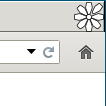
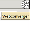
the logo embedded now a curious user can hover over the 35x35 flower icon
embedded into the top right of the {webconverger,webcnoaddressbar} chrome to
see the tooltip Webconverger. They cannot interact with the icon and cannot
click away to browse https://webconverger.com/ for example.
Hopefully our new symbol can give confidence to the user that the are using a secure & privacy concious Web kiosk!